Previously in this series (1, 2), we discussed the different map projections and coordinate systems that can be used for map generation. We also looked at the reasons for the many different projections, and some of the reasons why we might wish to choose a different projection.
In this article, I shall make the case that the choice of projection for most commercial web mapping applications has been made for simply historical reasons. When used properly, the projection is adequate for many applications; it is a very bad choice for applications where spatial distribution and map statistics are important
Later this week in the second and third parts of this article, I shall explore alternative equal area map projections that could be used for these applications.
Mercator: A Good Choice for Navigating
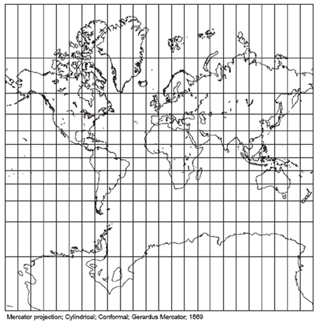
With the exception of MapQuest (which I shall cover below), all of the commercial online mapping services use the Mercator projection. This is a cylindrical projection introduced by Geradus Mercator (1512-94) in 1569. As such it has straight line meridians and straight line parallels that are perpendicular to the meridians. Unlike earlier cylindrical projections, the parallels are spaced further apart as the poles are approached. This spacing is directly proportional to the increasing scale along the poles. Technically the poles lie at infinity, so all Mercator maps are truncated at the top and bottom.

This scaling effect results in a conformal projection, ie. one where local angles are preserved. However, this was not the reason for Mercator’s development of this projection. The Mercator projection has the remarkable property that all rhumb lines are straight. A rhumb line is a navigation line of constant compass bearing. The shortest line on a sphere between two points is on a great circle. If you travelled along this path, you will find that the course’s compass bearing varies continuously. A rhumb line is longer, but the bearing is constant along the course’s entirety. This makes navigation much easier – and was invaluable in the 16th century when the projection was created.
The Mercator projection has always been a useful navigation tool. It was first used in a sea atlas of the world in 1646-7 by Robert Dudley. By the 18th century it was in widespread use for maritime maps, and it was occasionally being used for land maps. By the 19th century it was in widespread use for maps of world’s land masses, and today it is the most well known projection of all.
Mercator: A poor choice for global maps and geo-statistical maps
This is very unfortunate. The Mercator projection is a very good projection for marine navigation, but it is very poor choice for a map that represents the world’s land masses and their relative shapes and sizes. Greenland is famously stretched on the Mercator projection: it looks slightly larger than Africa when in reality Africa has an area 14 times larger! Other sizes are also distorted, for example Europe appears about double the size of what it should be.
Distortion of the Mercator projection is less along the equator, and it has been used appropriately for maps of the East Indies. The Universal Transverse Mercator system also uses this feature by using transverse Mercator projections aligned along multiple meridians, instead of the equator.
Poor size distortion also makes the projection a very bad choice for geostatistical applications where distributions, densities, and relative areas are important.
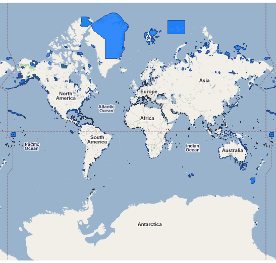
For example, the following screenshot is from the World Database on Protected Areas (WDPA). This is a map of protected marine areas, and uses Google Maps as a base map:

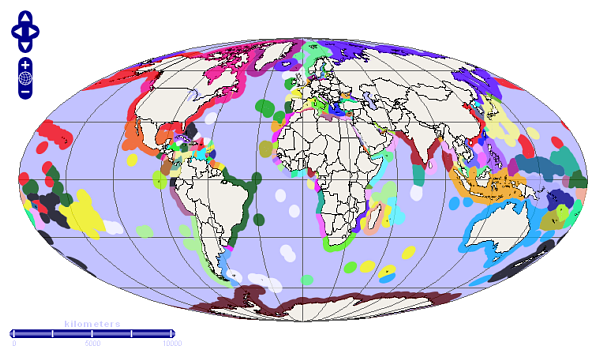
Note that this map gives the appearance that Greenland, Spitzbergen, and Franz Josef Land comprise the bulk of the world’s marine reserves! They are definitely significant, but in reality they do not dominate. In contrast, this map of maritime territories uses an equal area Mollweide projection to give a much more realistic representation of relative areas:

MapQuest’s Projection
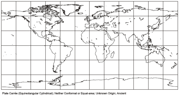
MapQuest differs from the other online map services, in that it uses an “Equirectangular” projection with a Standard Parallel of 37.5 degrees. This is also a cylindrical projection, and is sometimes also known as a “Simple Cylindrical Projection”. Unlike the Mercator projection with its constantly varying scale, the Equirectangular has the scale fixed to be correct for the standard parallel. Ie. Shape and area are correct along the standard parallel but are increasingly distorted away from these two lines.

The overall effect has considerably less area distortion than the Mercator projection, but areas continue to be distorted. The polar regions are less distorted, but area distortion is also introduced to the equatorial regions.
Although the distortion is better than the Mercator projection, the MapQuest Equirectangular projection does not preserve area and is unsuitable for geostatistical and global distribution applications.
Plotting on a Globe
One alternative is to plot the data on a globe. Google Earth (when zoomed out) is an effective solution that uses this approach. Globe mapping applications invariably use a plug-in if used in a web application, although this does not have to be the case.
The major problem with a globe, is that only half of the Earth is ever visible. Shape and area are also distorted towards the horizon. The user has to rotate the globe in order to see individual areas properly, and cannot easily compare between different regions.
Conclusions
Probably for historical reasons, most commercial web mapping applications use the Mercator projection. This is an excellent choice for marine navigation (especially in earlier times) but is an extremely poor choice for representing the globe, for analysing geospatial distributions, or for geostatistical applications.
This limited range of projections, results in otherwise excellent applications (eg. World Database on Protected Areas, and
Dr Henry Niman’s FluTracker) being forced to use the unsuitable Mercator projection. Greenland dominates the World Database on Protected Areas, and the FluTracker has a visual bias towards mid-level latitudes relative to the equatorial regions (there are few flu cases in the polar regions due to their very low population densities). These maps would produce better representations of the data, if they were plotted using an equal area projection. Such a projection would preserve relative sizes (eg. marine protected areas) and data density (eg. flu cases).
The second and third parts of this article will look at some possible equal area projections which might be usable and better suited for global map applications such as these. This will be followed next week by an article that creates a practical web application that allows a user to plot their data using one of a number of equal area projections.
Acknowledgments
The images of the Mercator and Equirectangular projections are public domain images produced by Paul B Anderson.